Level Up Your CX Game With Dashboards
Understanding your customers is crucial in today's competitive business world. Customer experience (CX) dashboards empower businesses to visualize important metrics, identify problem areas, and make informed decisions to improve customer satisfaction and loyalty. Are you struggling to see the complete customer journey? Is pinpointing areas for improvement and demonstrating the ROI of your CX initiatives a challenge? The right CX dashboard can turn raw data into actionable insights, allowing you to optimize every interaction and boost your bottom line.
Selecting the best CX dashboard depends on several factors. These include the size and complexity of your business, the specific metrics you need to track (like customer satisfaction score (CSAT), Net Promoter Score (NPS), churn rate, and resolution time), and integration capabilities with existing CRM and support systems. Budget is also a key consideration.
A good CX dashboard provides clear visualizations, customizable reporting options, real-time data updates, and strong analytics features to uncover hidden trends.
Some CX dashboard solutions offer pre-built templates and integrations, while others require more technical expertise and customization. Pricing models also vary, from subscription-based services to open-source options with potential development costs.
Exploring Leading CX Dashboard Examples
In this article, we’ll explore several leading customer experience dashboard examples, covering various platforms and functionalities. We'll look at their strengths and weaknesses, pricing, and technical requirements. This information will help you choose the right tool to elevate your customer experience strategy. Get ready to unlock the power of data and take your CX from good to exceptional!
1. Zendesk Explore
Zendesk Explore is a powerful customer experience analytics platform. It provides a comprehensive view of your customer interactions. By consolidating data from all your Zendesk products, Explore offers pre-built and customizable dashboards. These dashboards empower you to visualize the entire customer journey. You can also track key satisfaction metrics like CSAT, NPS, and CES, and identify emerging trends in customer behavior. This makes it a valuable tool for customer service managers, support team leaders, and CX directors. They can use the data-driven insights to optimize their support strategies and improve overall customer satisfaction.
Why does Zendesk Explore deserve its place on this list? Its seamless integration with the Zendesk Zendesk ecosystem makes it incredibly easy to centralize and analyze all your customer support data. The intuitive interface and pre-built dashboards require minimal training. This allows teams to quickly start generating actionable insights. Combined with its robust reporting and analytics capabilities, it’s a top contender for businesses already invested in the Zendesk suite.
Key Features and Benefits
-
Pre-built CX dashboards with customizable metrics: Get started quickly with pre-configured dashboards. These focus on key metrics like resolution time, customer satisfaction, and agent performance. Customize these dashboards to track the metrics most relevant to your business.
-
Omnichannel analytics across all customer touchpoints: Track customer interactions across all channels. This includes email, chat, phone, and social media. The goal is to gain a holistic understanding of the customer journey. This omnichannel view helps identify pain points and areas for improvement across different communication channels.
-
Real-time CSAT, NPS, and CES tracking: Monitor customer satisfaction scores in real-time. This allows you to identify and address issues promptly, enabling proactive intervention and preventing negative experiences from escalating.
-
Custom report builder with drag-and-drop functionality: Create custom reports tailored to your specific needs using the intuitive drag-and-drop interface. This flexibility empowers you to delve deeper into specific areas and generate highly targeted reports.
-
Team performance and SLA compliance monitoring: Track agent performance and ensure adherence to service level agreements (SLAs). This data helps identify top performers, areas for coaching, and opportunities to optimize team efficiency.
Pros and Cons of Zendesk Explore
Here's a quick overview of the advantages and disadvantages:
| Pros | Cons |
|---|---|
| Seamless integration with all Zendesk products | Can be expensive for smaller organizations |
| Intuitive interface, minimal training | Some advanced features require higher-tier plans |
| Extensive sharing and collaboration options | Limited integration with non-Zendesk platforms |
| Robust filtering and segmentation options | Performance can slow with very large datasets |
Implementation and Setup Tips
-
Start with the pre-built dashboards to familiarize yourself with the platform.
-
Identify your key performance indicators (KPIs) and customize dashboards accordingly.
-
Leverage the segmentation options to analyze specific customer groups and identify trends.
-
Regularly review reports and dashboards to track progress and identify areas for improvement.
Pricing and Technical Requirements
Pricing: Zendesk Explore pricing is tiered and based on the number of "seats" required. Contact Zendesk directly for detailed pricing information.
Technical Requirements: Zendesk Explore is a cloud-based platform. It requires no specific hardware or software installation beyond a web browser.
Comparison with Similar Tools
While tools like Power BI Power BI and Tableau Tableau offer more extensive data visualization and integration capabilities, Zendesk Explore shines with its seamless integration with the Zendesk ecosystem. This makes it a particularly compelling option for businesses already using Zendesk for customer support.
Website: https://www.zendesk.com/explore/
2. Tableau CX Dashboard
Tableau is a powerful data visualization and business intelligence platform known for its robust customer experience (CX) analytics. It helps organizations transform raw customer data into interactive and visually appealing dashboards, revealing hidden insights and driving data-informed decisions. This makes it a valuable tool for Customer Service Managers, Support Team Leaders, and CX Directors seeking a comprehensive understanding of the customer journey.
Tableau's strength lies in its flexibility. Unlike specialized CX solutions with pre-defined metrics and visualizations, Tableau lets businesses tailor dashboards to their specific needs. This granular control enables tracking of specific Key Performance Indicators (KPIs) relevant to individual business goals, from customer satisfaction (CSAT) and Net Promoter Score (NPS) to customer churn rate and lifetime value.
Practical Applications and Use Cases
-
Customer Journey Mapping: Visualize the entire customer journey, identifying pain points and areas for improvement. Tableau lets you map customer interactions across different touchpoints for a holistic view of the customer experience.
-
Real-time Customer Feedback Analysis: Connect Tableau to live data sources like CRM systems and survey platforms to monitor customer feedback in real time. This allows for proactive intervention and quick responses to emerging issues.
-
Predictive Analytics: Use Tableau's forecasting capabilities to anticipate customer behavior, identify potential churn risks, and personalize customer interactions proactively. This allows for targeted campaigns and proactive customer retention strategies.
-
Segmentation and Targeting: Analyze customer data to segment audiences based on demographics, behavior, and preferences. This allows for personalized marketing campaigns and tailored customer support interactions.
Features and Benefits
-
Highly Customizable Dashboards: Build bespoke dashboards with drag-and-drop functionality, choosing from a large library of charts, graphs, and interactive elements.
-
Advanced Data Visualization: Create compelling and insightful visualizations that communicate complex data effectively, enabling faster comprehension and improved decision-making.
-
Real-time Data Connections: Integrate with various data sources, including CRM systems, databases, and social media platforms, for up-to-the-minute insights.
-
Interactive Filtering and Drill-Down: Explore data at different levels of granularity, allowing for in-depth analysis and identification of trends.
Pros and Cons of Using Tableau
Here's a quick overview of the advantages and disadvantages:
| Pros | Cons |
|---|---|
| Unmatched Visualization Flexibility & Customization | Steep Learning Curve for Non-technical Users |
| Enterprise-grade Security and Governance | Higher Cost Compared to Specialized CX Solutions |
| Powerful Data Blending Capabilities | Requires Significant Implementation Resources |
| Strong Community and Template Sharing Marketplace | May Need Additional Tools for Data Preparation |
Pricing and Technical Requirements
Tableau offers a variety of pricing plans based on user type and deployment options. Detailed pricing information can be found on their website. Technical requirements vary depending on the deployment model (cloud or on-premise).
Comparison with Similar Tools
Compared to tools like Power BI, Tableau generally offers greater visualization flexibility, while Power BI is often considered more user-friendly for non-technical users.
Implementation/Setup Tips
Start with a clear understanding of your CX goals and the key metrics you want to track. Use Tableau's extensive online resources and community forums for guidance. Consider starting with pre-built templates and gradually customizing them to your specific needs.
Why Tableau Deserves Its Place on the List
Tableau's powerful visualization capabilities and flexible architecture make it a top choice for organizations that need highly customized CX dashboards. While it has a steeper learning curve and higher price point than some other tools, its power and flexibility are unmatched, making it an excellent option for businesses that prioritize data-driven CX management.
Website: Tableau Customer Analytics
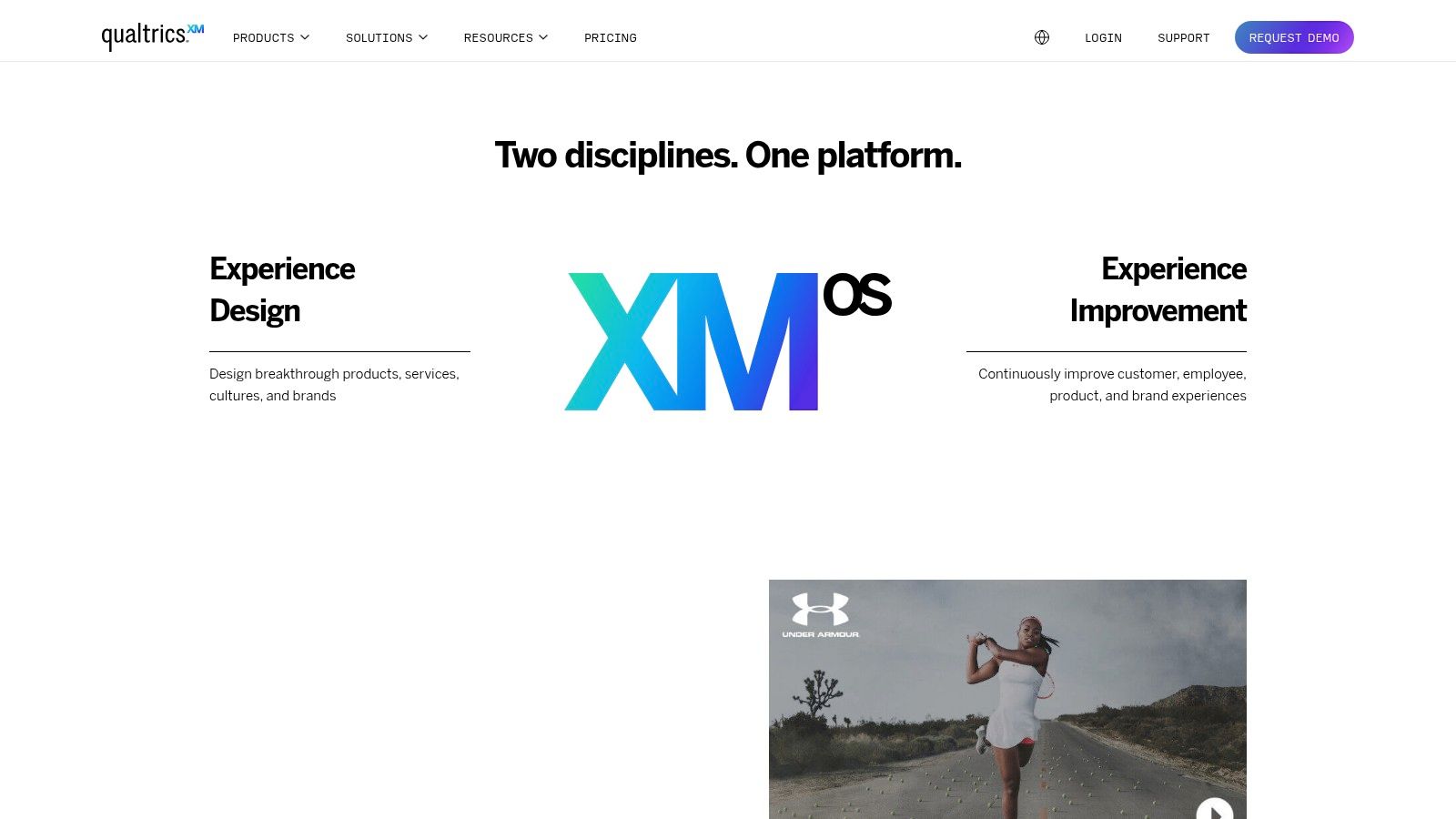
3. Qualtrics XM Dashboard
For organizations dedicated to improving their customer experience, the Qualtrics XM Dashboard offers a robust suite of tools. This enterprise-grade platform moves beyond simple customer satisfaction surveys to provide a complete view of the customer journey across every touchpoint. It blends operational data with experience data (X-data) to create a holistic picture, helping businesses understand the reasons behind customer behavior.
Qualtrics XM utilizes its proprietary iQ technology, an AI-powered engine that automatically identifies experience gaps and highlights areas for improvement. This intelligent analysis allows businesses to proactively address issues before they escalate, ultimately minimizing customer churn and enhancing customer loyalty. Imagine automatically identifying a dip in satisfaction after a product update – Qualtrics XM can uncover this insight and help you grasp the underlying causes.
Journey Mapping and Role-Based Dashboards
Journey-based analytics visually map every customer interaction, allowing you to see the entire customer lifecycle. From the initial website visit to post-purchase support, you gain a precise understanding of customer behavior at each stage. This detailed view is vital for optimizing the customer journey and identifying friction points that negatively impact the customer experience. Role-based dashboards further customize the information presented to various stakeholders, ensuring everyone from front-line support to executives has the insights they need.
Predictive analytics empowers businesses to anticipate customer churn. By identifying at-risk customers, proactive intervention with targeted retention strategies becomes possible. Furthermore, action planning tools are directly integrated within the dashboards, streamlining the process of transforming data into actionable improvements. For example, if negative feedback emerges concerning website navigation, you can immediately assign tasks and track progress toward a resolution within the platform.
Features and Benefits of Qualtrics XM
Here's a summary of the key features and benefits:
Features:
- iQ technology for automated experience gap identification
- Journey-based analytics for comprehensive customer journey mapping
- Role-based dashboards for tailored insights
- Predictive analytics for churn prevention
- Action planning tools integrated within the dashboard
Pros:
- Comprehensive experience management across all channels
- Advanced statistical analysis accessible to non-technical users
- Strong closed-loop feedback capabilities
- Enterprise-grade scalability and security
Cons:
- Premium pricing structure
- Complex setup and configuration
- Extensive feature set can be overwhelming
- Some integrations may require additional development
Pricing and Technical Requirements
Qualtrics uses a customized pricing model based on specific business needs. Contact their sales team for a personalized quote. Qualtrics XM is cloud-based and accessible through a web browser. Integrations with various CRM and marketing automation platforms are available. You might also find our guide on sitemaps helpful for understanding website structure and navigation.
Implementation Tips
- Define clear objectives and identify key metrics to track.
- Invest in onboarding and training to fully utilize the platform.
- Start with a pilot program focusing on a specific customer segment before scaling across the organization.
Qualtrics XM Dashboard earns its spot on this list due to its comprehensive approach to experience management, powerful AI-driven analytics, and robust action planning features. While its complexity and cost may pose a challenge for smaller businesses, larger organizations seeking a sophisticated solution to manage and optimize the customer journey will find Qualtrics XM to be a worthwhile investment.
4. HubSpot Service Hub Dashboard
The HubSpot Service Hub Dashboard is a powerful tool for managing customer experience. It's especially useful for businesses already working within the HubSpot ecosystem, seamlessly connecting marketing, sales, and service data. This integration provides a complete view of the customer journey, enabling teams to anticipate customer needs and boost overall satisfaction.
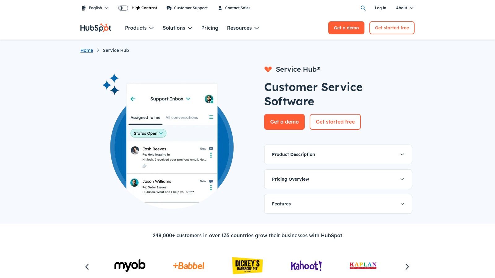
This dashboard brings key customer service metrics together in one place, allowing teams to monitor performance and pinpoint areas for improvement. Imagine tracking customer feedback through NPS, CSAT, and CES surveys, all within the same platform used for ticket management and knowledge base maintenance. This unified perspective simplifies data-driven decision-making and streamlines workflows.
Key Features and Benefits
Here are some of the key features and benefits of the HubSpot Service Hub Dashboard:
-
Customer Feedback Surveys: Gain valuable insights with integrated NPS, CSAT, and CES surveys. These tools allow you to measure customer sentiment and identify areas where service can be enhanced.
-
Ticket Management Analytics: Keep track of ticket volume, resolution times, and team performance to optimize workflows and ensure efficient service delivery.
-
Knowledge Base Effectiveness: Monitor how your knowledge base is being used and find any content gaps. This helps empower customers with self-service resources, reducing support ticket volume.
-
Time-to-Resolution and First Response Time: Tracking these vital metrics helps identify bottlenecks and improve response times, ultimately increasing customer satisfaction.
-
Customer Portal Usage: Analyze how customers engage with your customer portal to understand their use of self-service resources and identify areas for improvement.
Pros
-
Seamless HubSpot Integration: Benefit from using existing HubSpot data for a 360-degree view of the customer and a more efficient workflow.
-
User-Friendly Interface: Easily navigate and understand the data without needing advanced technical skills.
-
Affordable Pricing: HubSpot offers tiered pricing plans suitable for businesses of all sizes, including a free version for basic features.
-
Automated Reporting: Save valuable time and resources with automated reports delivered directly to your inbox.
Cons
-
Limited Customization: Compared to dedicated enterprise analytics tools, customization options are more limited, which might restrict advanced reporting.
-
Basic Statistical Analysis: The platform provides basic statistical analysis, which may not be sufficient for organizations requiring in-depth data analysis.
-
Feature Tiering: Some advanced features are available only in higher-tier packages, which could increase costs.
-
HubSpot Ecosystem Reliance: The Service Hub works best for companies already within the HubSpot ecosystem, as full integration depends on existing HubSpot subscriptions.
Implementation Tips
-
Define Key Metrics: Before setting up your dashboard, determine the most critical customer service metrics for your business.
-
Customize Reports: Tailor the dashboard to display the metrics most relevant to your team’s specific goals.
-
Integrate with Other Tools: Connect the Service Hub with other relevant tools, such as your CRM and marketing automation platforms, for a comprehensive view of the customer journey.
-
Regularly Review and Analyze Data: Make informed, data-driven decisions by regularly reviewing dashboard insights and identifying areas for improvement.
Website: HubSpot Service Hub
The HubSpot Service Hub Dashboard offers a user-friendly, integrated solution for tracking and improving customer experience. While it may not offer the same level of customization and in-depth analysis as some enterprise-level tools, its seamless HubSpot integration and affordable pricing make it a strong option for small to medium businesses already using HubSpot.
5. Salesforce Experience Cloud Dashboard
Salesforce Experience Cloud (formerly Community Cloud) helps businesses create connected digital experiences. These experiences are designed for customers, partners, and employees. Its dashboard provides key insights into how these audiences interact with your digital platforms. This makes it a powerful tool for optimizing the customer experience. Salesforce Experience Cloud stands out because of its robust features, seamless Salesforce integration, and focus on engagement and self-service.
Practical Applications and Use Cases:
-
Customer Support Communities: Track case deflection rates and identify trending topics in community discussions. You can also measure the effectiveness of your knowledge articles. This helps optimize self-service resources and reduce the workload on support agents.
-
Partner Portals: Monitor partner engagement and track deal registrations. You can also analyze partner performance. This leads to better collaboration and channel management.
-
Employee Intranets: Gauge employee engagement with internal communications and measure satisfaction with HR processes. You can also track the adoption of new tools and technologies.
-
Customer Onboarding: Monitor progress through onboarding milestones and identify areas of friction. You can also proactively address customer questions and concerns.
Features and Benefits
-
Einstein Analytics Integration: Use AI-powered insights to predict customer behavior and personalize experiences. You can also proactively identify potential issues.
-
Community Engagement Metrics: Track important metrics like login rates, active users, and content contributions. This allows you to understand community health and find opportunities for improvement.
-
Self-Service Effectiveness: Measure case deflection rates and analyze search queries. This lets you optimize knowledge base content and improve self-service success.
-
Customer Profile Completeness: Analyze how complete customer profiles are to identify data gaps. This also helps personalize interactions more effectively.
-
Customizable Dashboards: Create tailored visualizations and reports specific to your business needs using the Lightning Dashboard builder.
Pros
-
Seamless Salesforce Integration: Leverage existing CRM data and streamline workflows.
-
Robust Security and Compliance: Benefit from Salesforce's enterprise-grade security infrastructure.
-
Extensive Customization Options: Tailor the platform to meet your specific business requirements.
-
Mobile-Friendly Access: Access dashboards and insights from anywhere.
Cons
-
Significant Implementation Resources Required: Setup, configuration, and ongoing maintenance require dedicated resources.
-
High Cost Relative to Standalone Solutions: Salesforce Experience Cloud can be a substantial investment, especially for smaller businesses.
-
Complex Administration and Maintenance: Managing the platform can be challenging and may require specialized skills and training.
-
May Require Developer Support for Advanced Customizations: Implementing complex features or integrations might need developer support.
Pricing and Technical Requirements
Salesforce Experience Cloud pricing is tiered based on the number of users and features you need. For detailed pricing information, contact Salesforce directly. Technical requirements will depend on your specific implementation and integrations.
Comparison with Similar Tools
Other community platforms like Khoros and inSided offer similar features. However, Salesforce Experience Cloud's tight integration with the Salesforce ecosystem makes it a good choice for businesses already using Salesforce CRM. This integration simplifies data management and streamlines workflows.
Implementation/Setup Tips
-
Define clear objectives: Outline your goals for using Experience Cloud and identify the metrics you want to track.
-
Plan your community structure: Think about the structure and organization of your community. This will ensure easy navigation and information access.
-
Invest in training: Train administrators and users to maximize platform adoption and effectiveness.
-
Iterate and improve: Regularly review your dashboards and adjust based on user feedback and performance data.
Website: https://www.salesforce.com/products/experience-cloud/overview/
This dashboard helps customer service managers, support team leaders, and CX directors understand customer behavior within their digital experiences. Small business owners and entrepreneurs can also use its insights to optimize self-service offerings and improve customer satisfaction. Support operations managers can track key performance indicators and identify areas for improvement in their support processes.
6. Datadog Customer Experience Monitoring
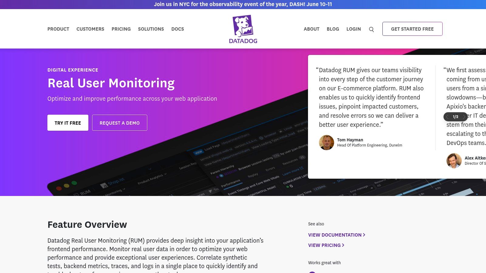
Datadog offers a robust suite of tools for monitoring the technical aspects of customer experience. This makes it particularly valuable for technically-inclined CX professionals. While it may present a steeper learning curve for non-technical users, its deep technical insights secure its place on this list. This is especially true for businesses heavily reliant on digital products and services. Datadog empowers organizations to connect technical metrics with key business indicators, revealing how technical performance impacts the bottom line.
Consider a scenario where your e-commerce platform suddenly sees a spike in abandoned carts. Datadog’s Real User Monitoring (RUM) combined with session replay can help identify the problem. Perhaps a specific page loads slowly, or a crucial form has JavaScript errors. By visualizing user journeys and examining error logs, you can pinpoint the technical root cause and fix it quickly. This minimizes lost revenue and boosts customer satisfaction. This real-time insight and ability to connect technical issues with business impact are Datadog's strengths.
Key Features & Benefits
-
Real User Monitoring (RUM): Tracks actual user experience across your website and applications, providing real-world insight into performance and usability.
-
Session Replay & User Journey Visualization: Replay individual user sessions and visualize common user journeys. This helps identify friction points and areas for improvement.
-
Error Tracking & Impact Analysis: Locate errors and measure their impact on customer experience, allowing for prioritized bug fixes.
-
Performance Correlation with Business Metrics: Directly links technical performance metrics with business KPIs like conversion rates and revenue. This reveals the real impact of technical problems.
-
Synthetic Monitoring: Simulates user interactions to proactively identify and resolve potential performance issues before they affect real users.
Pros
-
Deep Technical Insights: Offers granular visibility into the technical elements influencing digital experience.
-
Strong Correlation Capabilities: Effectively connects technical and business metrics for a comprehensive understanding of performance impact.
-
Real-time Alerting & Anomaly Detection: Provides instant notifications of performance problems, enabling quick responses.
-
Extensive Integration Ecosystem: Seamlessly integrates with a broad array of other tools and platforms.
Cons
-
Technical Focus: Primarily designed for technical users, potentially creating a learning curve for marketing and CX professionals.
-
Steeper Learning Curve: Requires some technical expertise for effective configuration and use.
-
Usage-Based Pricing: Offers flexibility, but costs can rise with increased usage and data volume.
-
Requires Technical Implementation: Setting up and integrating Datadog requires technical resources and skills.
Pricing, Technical Requirements & Implementation Tips
Pricing: Datadog uses usage-based pricing, varying depending on features and data ingested. See their website for details.
Technical Requirements: Implementation involves installing agents and configuring dashboards within the Datadog platform. Technical expertise is recommended.
Implementation Tips:
-
Start Small: Begin by monitoring a specific area or application before expanding to your entire digital ecosystem.
-
Define Key Metrics: Identify the essential metrics aligned with your business objectives and customer experience goals.
-
Utilize Dashboards & Alerts: Leverage Datadog's customizable dashboards and alerting capabilities to monitor performance and proactively address issues.
-
Integrate with Existing Tools: Connect Datadog with your current CRM, marketing automation, and other relevant platforms to gain a complete view of customer experience.
Website: Datadog
Datadog is a robust solution for organizations focused on optimizing the technical aspects of their digital customer experience. While its technical nature might not suit everyone, its power and depth of insights make it invaluable for a data-driven approach to CX improvement. For companies with in-house technical skills, connecting technical performance with business KPIs makes Datadog a worthwhile investment.
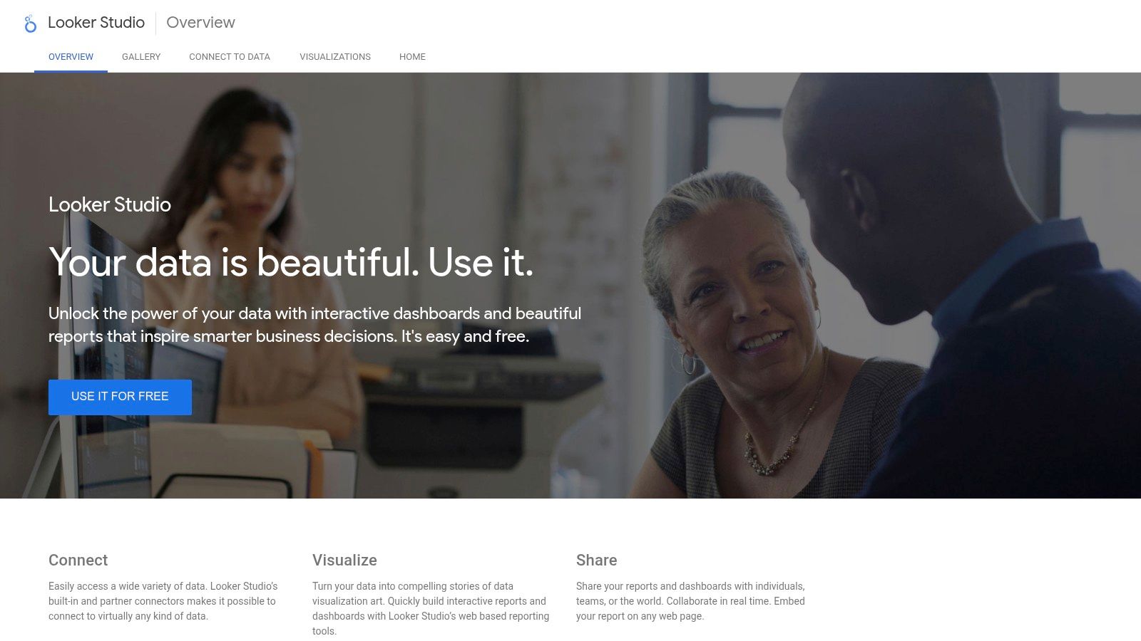
7. Google Data Studio CX Templates (Now Looker Studio)
Visualizing the customer journey and understanding key touchpoints is crucial for improving customer experience (CX). Looker Studio (formerly Google Data Studio) offers a powerful, accessible, and free solution for building insightful CX dashboards. This platform transforms raw data from various sources, including Google Analytics 4, into interactive and shareable dashboards. Its pre-built templates for common CX metrics make it especially valuable for organizations heavily reliant on the Google ecosystem, as well as small businesses and startups seeking a cost-effective solution.
Practical Applications and Use Cases
Looker Studio's versatility makes it applicable to a range of CX scenarios:
-
Website Engagement Analysis: Track key metrics like bounce rate, time on page, and pages per session. This helps understand how users interact with your website and identify areas for improvement.
-
Conversion Funnel Visualization: Map the customer journey towards conversion (e.g., product page to checkout). Pinpointing drop-off points allows for optimization of the sales funnel.
-
User Behavior Tracking: Analyze user demographics, interests, and behavior patterns. This data enables personalized marketing campaigns and tailored content for specific audience segments.
-
Customer Support Performance Monitoring: Connect Looker Studio to customer support platforms. Visualize metrics like resolution time, customer satisfaction scores, and agent performance.
-
Campaign Performance Reporting: Track marketing campaign effectiveness by visualizing key metrics. Focus on click-through rates, conversion rates, and cost per acquisition.
Features and Benefits
Looker Studio offers a range of features to facilitate CX analysis:
-
Pre-built templates: Jumpstart dashboard creation with templates designed for common CX metrics.
-
Direct connection to Google Analytics 4: Seamlessly integrate with GA4 to visualize website traffic and user behavior data.
-
Custom calculated fields: Create CX-specific metrics tailored to your business needs.
-
Multi-source data blending: Combine data from various sources, such as CRM systems and marketing platforms, for a holistic view of the customer journey.
-
Shareable, interactive dashboards: Easily share reports with stakeholders, allowing them to explore data through interactive filters and drill-downs.
Pros and Cons
Like any tool, Looker Studio has its strengths and weaknesses:
Pros:
- Free to use with generous limits: Accessible to businesses of all sizes.
- Seamless integration with Google products: Easily connect to various Google services.
- User-friendly interface for basic reporting: Intuitive drag-and-drop interface.
- Easy sharing and collaboration features: Share dashboards for collaborative analysis.
Cons:
- Limited advanced analytics capabilities: Lacks the advanced features of enterprise BI tools.
- Some data source connections require third-party connectors: May incur additional costs.
- Performance issues with very large datasets: Potential limitations with massive datasets.
- Less robust than enterprise-grade solutions: Fewer advanced features and customization options.
Implementation/Setup Tips
Getting started with Looker Studio is straightforward:
- Identify key CX metrics: Determine the metrics you want to track.
- Choose a relevant template: Select a pre-built template or start from scratch.
- Connect your data sources: Link Looker Studio to your data sources.
- Customize your dashboard: Tailor the template to your specific needs.
- Share and collaborate: Share your dashboards with stakeholders.
Comparison with Similar Tools
Looker Studio stands out as a strong free alternative to paid BI tools, especially for those within the Google ecosystem. While less feature-rich than enterprise solutions like Tableau or Power BI, its accessibility and ease of use make it a valuable option. Other tools, like Databox, focus more on marketing data, while Looker Studio provides a broader CX overview.
Looker Studio earns its place on this list due to its accessibility, free access, and seamless Google integration. It empowers customer service managers, support team leaders, and business owners to visualize crucial CX data, gain actionable insights, and improve customer experiences without a significant investment.
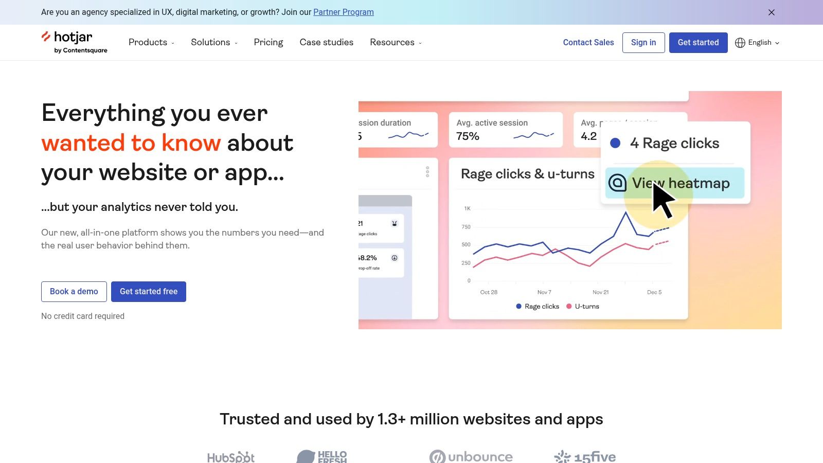
8. Hotjar Customer Experience Insights
Hotjar offers a unique approach to understanding customer experience. It provides visual insights into user behavior on your website or app. Instead of relying solely on traditional analytics, Hotjar uses heatmaps, session recordings, and feedback tools to show how users interact with your digital properties. This makes it valuable for Customer Service Managers, Support Team Leaders, and anyone working to improve the digital customer journey.
Practical Applications & Use Cases
-
Identify Usability Issues: Heatmaps show where users click, tap, and scroll. This reveals areas of interest and potential problems. For example, if users click on a non-clickable element, it suggests a design flaw.
-
Understand Customer Frustrations: Session recordings let you watch actual user sessions. They provide context to data and uncover pain points in the user journey. This helps you understand why users abandon carts or have trouble completing actions.
-
Optimize Conversion Funnels: Visualize user drop-off points within conversion funnels and find areas for improvement. This helps understand why users abandon the process and improve conversion rates.
-
Improve Form Design: Analyze form interactions to find fields causing frustration. This allows for streamlined forms and reduces friction during signup or checkout.
-
Gather Direct Customer Feedback: Feedback widgets and surveys help collect real-time feedback directly from users, offering insights into their experience.
Features & Benefits
Hotjar's features contribute to understanding the customer experience:
- Heatmaps: Visualize clicks, taps, and scrolling.
- Session Recordings: Watch real user sessions.
- Feedback Widgets & Surveys: Collect direct feedback.
- Conversion Funnel Visualization: Identify drop-off points.
- Form Analysis: Pinpoint friction points in forms.
Pros
- Intuitive Visualizations: Easy-to-understand representations of user behavior.
- Qualitative & Quantitative Data: Combines behavioral data with feedback.
- Easy Implementation: Minimal technical expertise is needed for setup.
- Affordable Pricing: Offers various pricing tiers.
Cons
- Limited Traditional Analytics: Not a full analytics platform.
- Sample-Based Data (Lower Tiers): Full data may require higher-tier plans.
- Privacy Considerations: Requires careful configuration to protect user privacy.
- Best Used as a Complement: Most effective when used with other analytics tools like Google Analytics.
Pricing & Technical Requirements
Hotjar offers a free basic plan and paid plans with more features and data. Implementation is usually simple, involving adding tracking code to your website. Pricing details are on their website.
Comparison with Similar Tools
While tools like Google Analytics provide quantitative data, Hotjar focuses on the why. Tools like Crazy Egg offer similar heatmapping, but Hotjar's combination of heatmaps, session recordings, and feedback tools provides a broader view.
Implementation Tips
- Start with a Specific Goal: Define what you want to achieve, such as improving conversion rates.
- Target Specific Pages: Focus analysis on key pages like landing pages or checkout flows.
- Combine with Other Analytics Data: Use Hotjar insights with data from other tools.
- Respect User Privacy: Be transparent about data collection and configure recordings responsibly.
Website: https://www.hotjar.com/
Hotjar offers a powerful way to gain deep insights into user behavior. Its visual approach makes it easy to identify areas for improvement and optimize the customer experience, leading to better conversions and happier customers.
8 Top CX Dashboards: Feature Comparison
| Dashboard | Complexity (🔄) | Resource Needs (⚡) | Expected Outcomes (📊) | Ideal Use Cases (💡) | Key Advantages (⭐) |
|---|---|---|---|---|---|
| Zendesk Explore | Moderate; intuitive drag-and-drop builder | Moderate; best for Zendesk ecosystem | Clear CX insights and support performance tracking | Organizations using Zendesk seeking CX visibility | Seamless integration, robust filtering and collaboration |
| Tableau CX Dashboard | High; steep learning curve | High; enterprise resources and technical expertise | Highly customizable visualizations and deep data insights | Large enterprises requiring flexible, detailed analytics | Unmatched visualization, powerful data blending |
| Qualtrics XM Dashboard | High; complex setup and configuration | Substantial; enterprise-level investment and setup | Holistic customer journey insights with AI-driven analytics | Organizations aiming for advanced experience management | AI-powered insights, comprehensive journey mapping |
| HubSpot Service Hub Dashboard | Low; user-friendly interface | Low to moderate; ideal for SMBs within HubSpot ecosystem | Unified view of customer service metrics and operational data | Businesses embedded in HubSpot ecosystem | Seamless CRM integration, built-in automation |
| Salesforce Experience Cloud Dashboard | High; requires skilled administration | Significant; needs developer support and robust resources | Detailed insights into customer interactions and self-service impact | Enterprises leveraging Salesforce for customer communities | Extensive customization, robust security and compliance |
| Datadog Customer Experience Monitoring | Moderate to high; technical implementation required | Moderate; requires technical expertise and integration efforts | Real-time technical and business performance correlations | Organizations focused on digital and technical performance | Deep technical insights, real-time alerts |
| Google Data Studio CX Templates | Low; accessible pre-built templates | Minimal; free access within Google ecosystem | Quick and accessible reporting of key CX metrics | Small to medium businesses using Google Analytics | Free to use, seamless integration with Google products |
| Hotjar Customer Experience Insights | Low; fast, straightforward implementation | Low; affordable with minimal technical skills | Visual user behavior insights combining qualitative and quantitative data | Organizations needing user behavior and feedback analysis | Intuitive visualizations, blends qualitative and quantitative data |
Transforming CX With the Right Dashboard
Choosing the right customer experience (CX) dashboard is crucial for gaining actionable insights and boosting customer satisfaction. With so many options available—including platforms like Zendesk Explore, Tableau, Qualtrics, HubSpot, Salesforce, Datadog, Google Data Studio, and Hotjar—the decision should be based on your specific business needs, budget, and technical capabilities.
When evaluating different tools, consider several factors. Think about the data sources you need to integrate, such as your CRM, helpdesk, or survey platforms. Assess the level of customization you'll need for your reports, the complexity of the analysis you want to perform, and the available visualization options. Some dashboards excel at real-time monitoring, while others are better for in-depth historical analysis.
Also, consider the users and their technical skills. User-friendly interfaces and intuitive navigation are essential for widespread adoption. A dashboard that's difficult to use will likely gather dust, no matter how powerful its features.
Implementing Your CX Dashboard
Implementing a new CX dashboard requires careful planning. Begin by identifying key metrics aligned with your business goals. Are you focused on improving resolution times, boosting customer satisfaction scores, or reducing churn? Your chosen platform should seamlessly integrate with your existing systems.
Data accuracy and consistency are paramount, so establish clear data governance processes. A pilot program, focused on a specific team or department, is a good way to gather feedback and refine your implementation strategy before a full rollout. This allows you to iron out any wrinkles and ensure a smoother transition for the entire organization.
Budgeting for Your Dashboard
Budget is a significant factor in your decision. Some platforms offer free versions with limited features, while others require a substantial investment. Consider not only the subscription cost but also the resources needed for setup, training, and ongoing maintenance. Open-source options like Google Data Studio can be cost-effective, but may require more technical expertise for customization.
Integrating With Your Existing Systems
Compatibility and integration with your current tech stack are vital. Check if the platform supports APIs and integrates with your CRM, helpdesk, and other relevant tools. Seamless data flow between systems ensures a holistic view of the customer journey and avoids data silos. This comprehensive perspective is key to understanding the complete customer experience.
By choosing the right CX dashboard and harnessing the power of data visualization and analysis, you can unlock valuable insights. Identify areas for improvement and create exceptional customer experiences that drive business growth and foster long-term loyalty. The right dashboard empowers you to make data-driven decisions that positively impact your bottom line and strengthen customer relationships.
Are you ready to transform your customer experience with real-time insights and streamlined support operations? SupportMan seamlessly integrates Intercom ratings directly into Slack, giving your team instant feedback and actionable data to improve customer satisfaction. Stop wasting time sifting through dashboards and start fostering a culture of continuous improvement, all within your existing workflow. Try SupportMan for free – no credit card required – and experience the power of real-time customer feedback today!