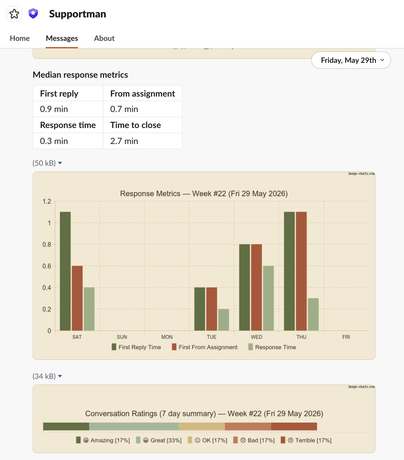
What changed
- Fixed 'First Reply' and 'Response Time' showing the same value — both now represent true data.
- New conversation ratings 7-day summary graph.
- New colour scheme across all charts.
- Reports only send to Intercom admins who were active that week — no more empty reports.
Why
Reports are only useful if the data is trustworthy and easy to read at a glance. The First Reply bug meant agents were seeing misleading numbers every week, and the old charts made it hard to spot patterns quickly. These updates make the weekly report something your team can actually act on.
The new colour scheme also reflects where Supportman is heading — warmer, more human, less clinical. Support work is people work, and the tools that support it should feel that way too.
Sneak peek